![]()
User experience in VR is already a very broad topic. If you're just getting started with virtual reality, you'll quickly realize that we're all standing on the tip of an iceberg, with a lot of undiscovered VR interactions and experiences laying unexplored beneath the surface.
Below is a collection of insights that I've had in the VR design work I've done myself, as well as observations I've made going through a wide variety of VR experiences made by others. Developers and designers who are new to the medium can use this guide to get a jumpstart on their own journey into VR.
VR: it's like theatre in the round
In a lot of my own work, and the way I will talk about some of the topics here, I draw a lot of inspiration from theatre. In particular, theatre in the round is very relevant. Both VR and acting in the round have a lot of the same unique features, most notably:
- No place to hide, no angle your audience won't be able to see things from.
- Deep connection and engagement with the audience due to the intimacy of the setting and proximity of everyone involved.
In VR, the line between the audience and the actors is blurred beyond recognition. A user in VR isn't an audience member, they're an actor you've invited on-stage to perform with the rest of the company. And even more perplexing, they haven't read the script!

A maybe not totally inaccurate depiction of dropping new users into a VR experience
This places huge importance on the first few minutes of the VR experience: as far as the user is concerned, it's all improv. Make sure you've considered what scaffolding guidance you can offer to ensure that your users know where they are, who they are, and what they're supposed to do next.
Other topics like stage directions, set design, and using props are all areas that someone building VR experiences should familiarize themselves with. Here are some handy rules about staging for theatre in the round that you can consider when considering the user experience your virtual world is providing. I also recommend the book Computers as Theatre for theatre-inspired design thinking that dives deep into the details.
Drawing attention
When you're given the freedom to move around and look at whatever you want, it can be challenging to get users to pay attention when you want them to. It's easy to miss action outside your field of vision, or instructions/hints for how to complete a puzzle.
Lighting
How everything is lit can help direct, guide, and hold attention. Spotlights are handy for pointing out specific areas / objects that you want users to focus on, especially if they come with a directional "turning on" sound effect. The way certain areas remain lit or unlit can provide passive information about where users are able to go or what they're able to interact with.
Lowering the "house lights" and using directional lighting on active NPCs can be a good way to lead the user's attention through scenes where they're not directly interacting with anyone.
Objects
Set design and environment design go hand-in-hand when you're working in VR. Objects that the player directly manipulates with their hands the most should be facing toward the player and placed well within reach, making them easy to find.
Adding visual effects to objects is a great way to call out specific objects in the environment. There are a handful of VR experiences that highlight objects or places where objects can be used in order to clarify that there is a possible interaction.
The example below is from Job Simulator, showing how color can be used to indicate potential interactions with objects near the player's hands:
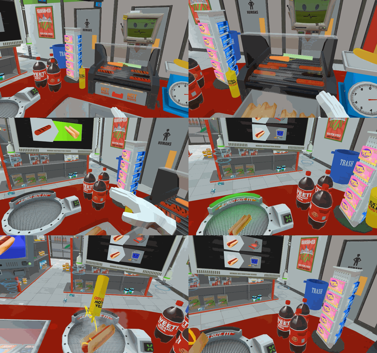
Interactable objects highlighted in blue in Job Simulator by Owlchemy Labs
Audio cues
Audio provides a passive steady stream of information that tells users everything they want to know about their surroundings, including where everything is located and where the action is happening.
Use directional audio in 3D space to direct attention where you want it to go. Sound effects that are carefully placed in the virtual environment can help turn heads so your players don't miss important events, especially when used in tandem with attention-catching visual effects.
If a character is talking, their voice should be coming from their physical location, and you may even need to move the character around while they're talking in order to direct attention where it's needed.
Eye contact
Humans are naturally attracted to looking at faces and eyes. Getting someone's attention can mean using virtual eye contact to direct their gaze and tell them what to focus on. Are there characters in your game that the player is directly interacting with?

Henry, a VR experience from Oculus Story Studio that uses eye contact to increase the feeling of presence
Henry is a character in a VR experience made by the Oculus Story Studio who makes eye contact with the player at meaningful moments to create presence in the space with him.
When used in moderation, meaningful eye contact is very good at creating a sense of presence in VR, and can be effective even to the point of creepiness, e.g. if a character is following you around with their eyes at all times. (It depends on what mood or feeling you're trying to evoke!)
What doesn't work as well?
There are a handful of attention-grabbing techniques that are hit or miss, depending on how they're implemented:
- text placed on or near the user's hands
- text floating around in the environment
- static signs placed in the user's field of view that try to convey vital info
Your surroundings in VR can be so immersive and arresting that it's easy for some users to miss mundane tutorial signs or text near the controllers (the VR equivalent of tooltips).
Fantastic Contraption is a great example of where big text anchored to the controllers is effective enough to serve as an instructional guide that helps people understand how to play the game.
Your mileage may vary, these methods are unreliable. It's not immediately intuitive for users to look at their hands in order to receive instructions, and users who don't notice your helper text anchored to the controllers might end up lost or confused about what they're supposed to do.
While it's true that anything can get attention if there are very few things to look at, or if something is so huge you can’t help but see it, big floating lines of text comes at the cost of obscuring the user’s (beautiful, immersive) surroundings. Use text or signage in VR intentionally and make every effort to integrate it into the visual style / atmosphere you're trying to create.
Height and accessibility
The VR headset you will be working with places the camera at face-level for the person wearing the HMD. In some VR prototypes, it's easy to guess how tall the designer was because every virtual object tends to get placed at the perfect height for someone exactly as tall as they are.
If you're 5' 10" and built the environment to suit people as tall as you are, you are missing crucial accessibility issues, not just for people shorter than you but users with different physical abilities as well.
Women will tend to have a shorter head-height, and so will people sitting in wheelchairs, or users who are bed-bound. Can people sitting down still play your game or move around your VR environment?
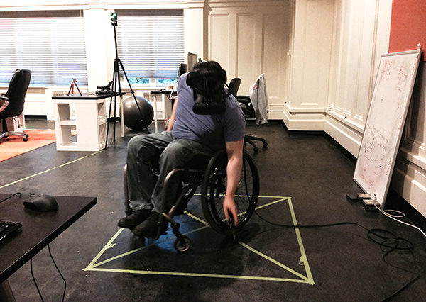
Wheelchair range of use while in the HTC Vive
We also need to consider kids who have short legs & arms, they might not be able to see or reach everything an adult can. Is something placed high up on a shelf or counter, putting it out of sight for anyone under 5 feet tall? Can an 8-year-old easily reach everything they need to interact with?
Adjustments in the form of a height setting the user sets before they begin the VR experience can be used to alleviate some of these problems. Adapted environments and interaction systems can be provided to users who are unable to use the controllers, or who are unable to navigate around in VR by moving their body.
Nausea
It wouldn't be a good user experience guide for VR without talking about virtual simulation sickness. This topic has already received the most amount of attention of any topic we're discussing here.
The single best thing you can do to avoid nausea is to maintain the ideal framerate that has been suggested by HMD hardware companies like HTC and Oculus: 90fps in each eye. Beyond that, it depends on the design of your user experience.
The most straight-forward guide on designing to prevent nausea in users is UploadVR's article that presents five ways to reduce motion sickness. There are also other solutions that people have tried, like giving the player a virtual nose or using audio design to alleviate symptoms.
There isn't and will probably never be a one-size-fits-all answer to preventing nausea entirely for every user in every experience. Each VR project will have its design challenges when it comes to VR sickness, depending on your method of locomotion, variable framerates, etc.
A minority of people seem to be completely immune to VR-induced nausea, and can comfortably go through experiences in virtual reality that would make other users instantly sick. Testing early and often on a variety of users is the best way to tell if your user experience is turning people's stomachs.
Room-scale and beyond
If you're working on a VR experience that provides motion tracking, you will want to consider the space people have available at home or in their office, as well as what movements are possible with the hardware you're making your VR experiences for.
Here is an example of a room-scale VR setup from Stress Level Zero's studio, with the boundaries outlined in 3D space around the VR user:
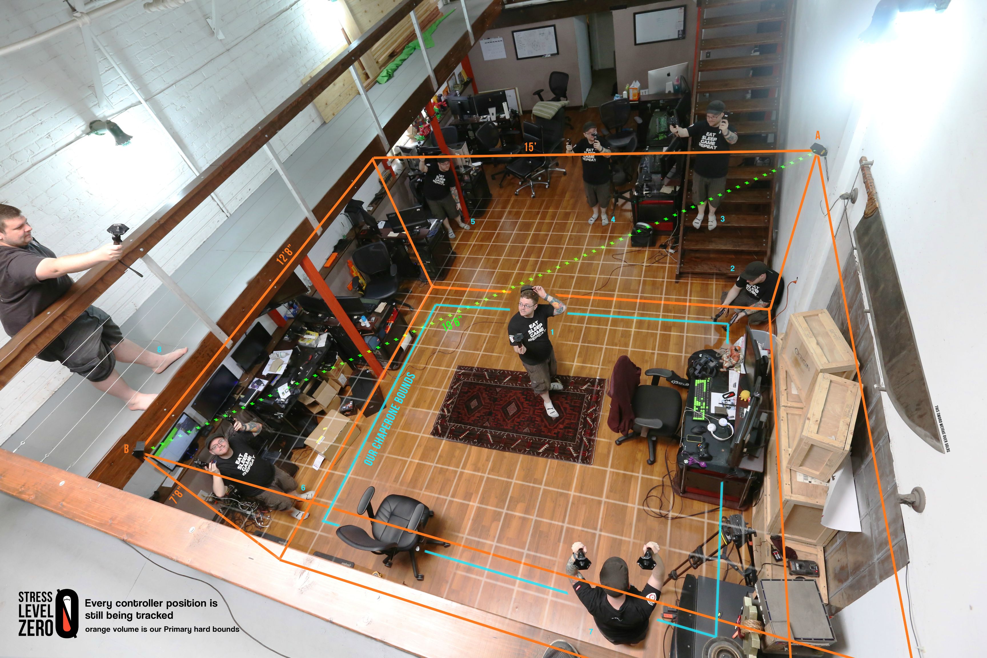
A visualization of room-scale playspace using the HTC Vive
Designing within limits of the space that users will have available to them is up to each project. There's a desk that's sitting in the active space available in the picture above, which is handled by the HTC Vive chaperone system.
But what can we do if the virtual space exceeds the physical space available to move around in?
Teleporting
Teleporting is a solution that many have implemented, and seems to work best when it’s integrated into the environment. Show users where they can teleport to, or give them something that lets them teleport whenever they want to.
Here's an example of teleporting mid-action from Bullet Train by Epic Games:
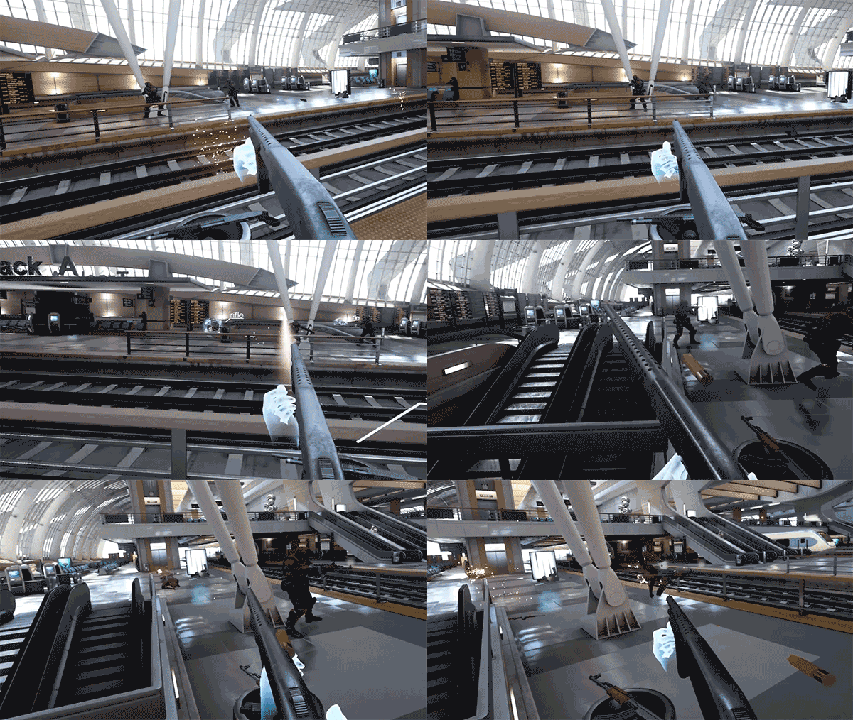
Teleporting as a seamless part of gameplay in Bullet Train by Epic Games
And another example of teleporting from Budget Cuts by Neat Corp.:
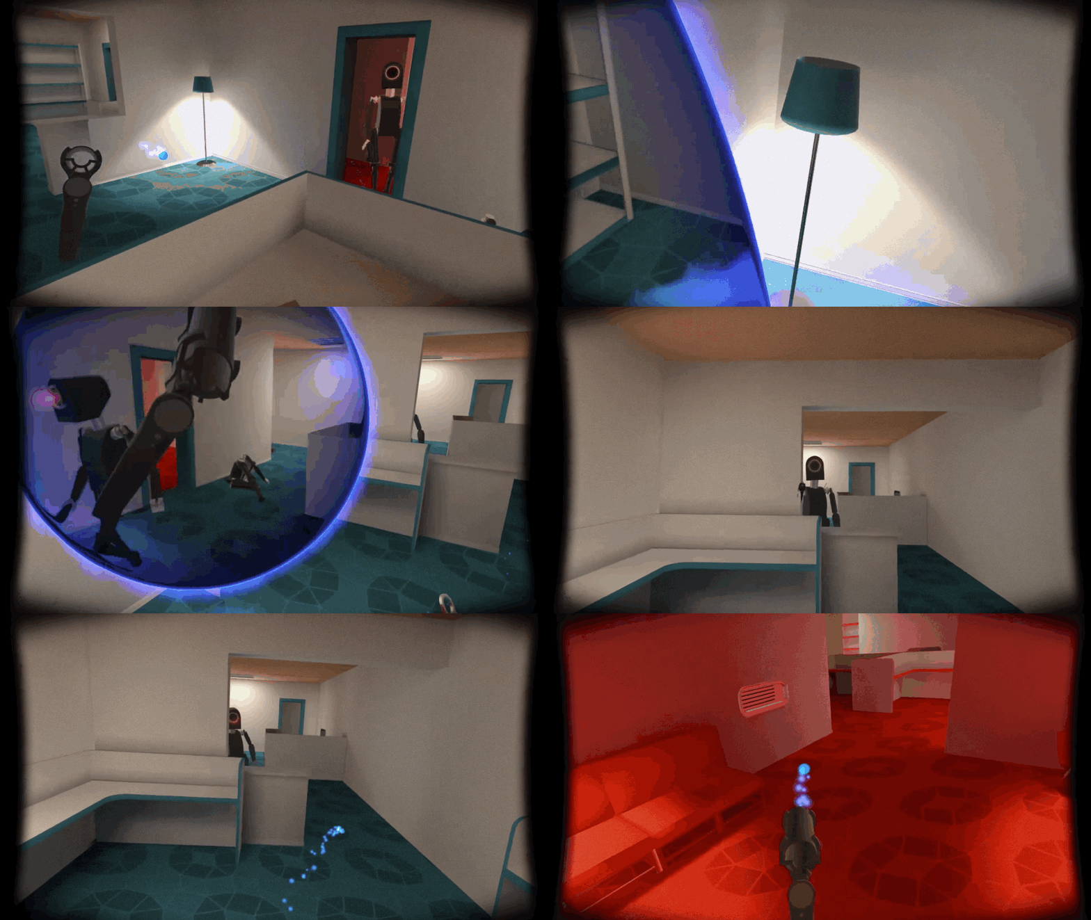
Teleporting to maneuver in Budget Cuts
Players who are allowed to teleport quickly over and over again can make themselves sick, so be careful when relying on this kind of locomotion design.
There is also a teleportation system in development called Blink VR that is worth taking a look at, as well as a variety of other approaches that may be more or less successful, depending on how it gets implemented.
Moving the player camera
If your experience design requires the player camera to move independently of the player's head, try using linear movement with instantaneous acceleration (no ease-in or ease-out). You can read a more in-depth exploration of why and how to design using linear movement from the developers of a VR game called Dead Secret. Here is an example of linear movement in action from an upcoming VR game in the Attack on Titan series.
Beware, even this approach might make sensitive users nauseous. Be sure to test linear movement often and with a wide variety of users.
Full-screen camera motion
A VR experience where users are piloting a ship or plane that moves through space with them inside can also spell nausea. Give the user a near-field frame of reference like a cockpit or the interior of your dashboard so their vestibular and proprioception systems don't go crazy with all the contradictory information they're getting visually.
Here is a hands-on example of what near-field framing looks like in Elite: Dangerous, and another example using near-field objects and structures from Hover Junkers for the HTC Vive.
Atmosphere and emotion
Because VR transports users so well into their new surroundings, the atmosphere and emotional impact of the virtual world will color the user experience heavily. Is the mood ominous or playful? Is the world close-quarters, or impossibly huge? High up in the air or underwater?
Mood created with lighting, music, and visual style will influence feelings like how trustworthy the space feels, or whether the user is calm or anxious. Take every effort you can to harmonize the VR environment with the emotions you want your users to have.
Object scale
You can also play with environment / prop scale to create a specific feeling. Small objects will feel cute and toy-like, easy to pick up with your hands. Bigger objects placed nearby will make users feel fenced-in, as if they have to lean or walk around them.
Prop furniture can take advantage of this if it's life-size, things with hard surfaces might come across so realistic that some users forget they're not real and try to place a hand or their controller on a nearby table!
Environment & world setting
Transporting users to places they've never been also means being able to take them to beautiful locations. Think outside of the box when it comes to the environment your users are in and how it will influence their emotional state. If anything, VR is a chance to get creative and artistic with your environment.
User interfaces
In real life, a lot of the objects we use are part of the user interface of our environment, e.g. light switches. One of the best parts of VR is the enjoyment and immersion that comes from those same physical interactions we get in real life with objects that look and feel like the real thing.
The freedom to interact with the virtual UI the same way I can with objects in reality will help increase immersion and can bring a sense of delight when users decide to interact with the interface. Fantastic Contraption is a great example of making a user interface fun to interact with.
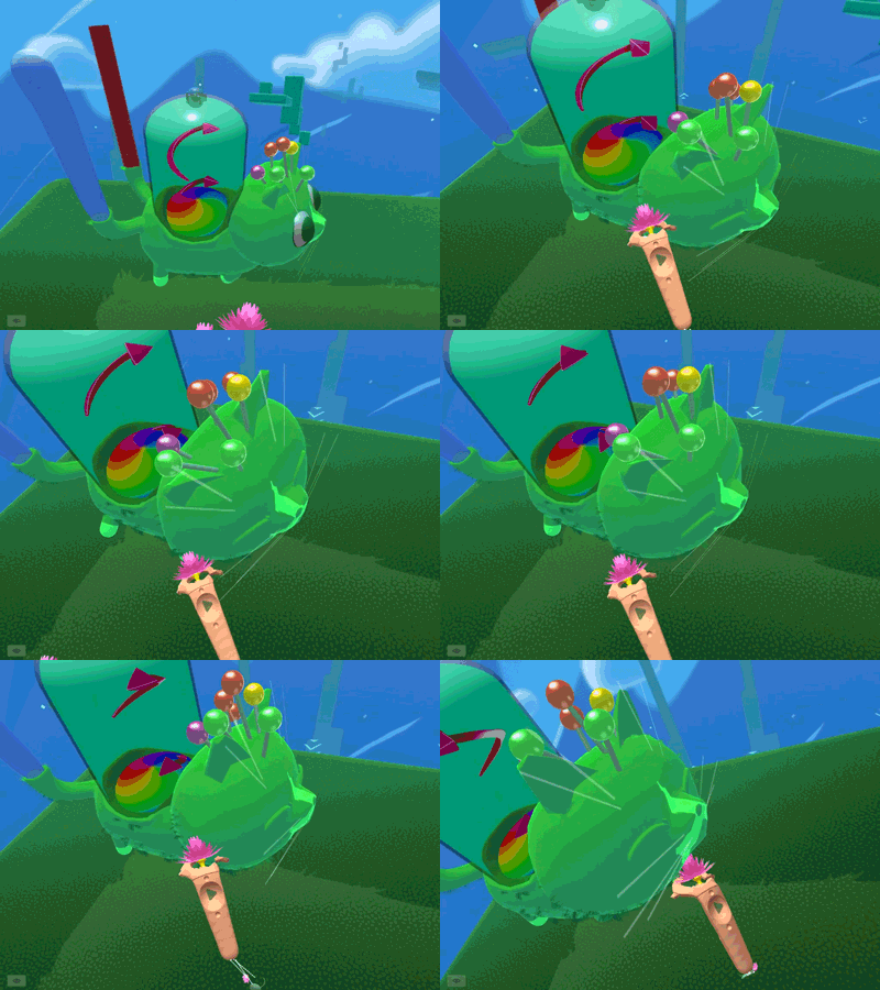
Yes, the cat is part of the UI! (Its name is Neko, of course.)
Here's another example of a menu that's been hidden inside a briefcase as physical objects from another VR game coming out soon:
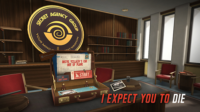
Menu choices as physical objects in I Expect You to Die
If your UI can't actually be part of the environment (or a cat), allow the player to call it up / move it out of the way whenever they want to. Tiltbrush does a great job of this by mapping the majority of their UI menu to a very specific action: pointing the right controller at the left controller.
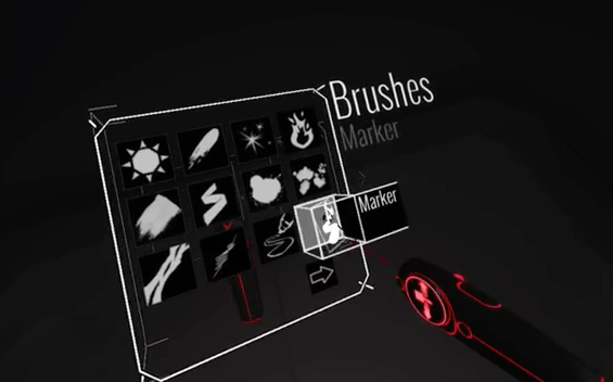
2D menu drawn in 3D and attached to the controller in Tiltbrush
As soon as you access the menu, you can quickly make a selection from it. When you move your hand away to use the tool you've selected, the menu hides out of the way.
Bringing 2D into 3D
What worked for UI on flat screens and mobile devices might not translate well to virtual reality. 2D user interfaces commonly use abstractions of real objects, like buttons and switches, to represent actions you can perform. Since VR puts us inside a 3-dimensional virtual space, being abstract in the way we represent objects isn't really necessary anymore.
If we don't need to be abstract, there's no reason to. Instead of giving your users a laser pointer and having them select the "turn on" button from a flat 2D panel floating in mid-air, try offering them a physical switch panel that clicks into place and turns the lights on when they flip it.
Various physical object interactions using a physics-based interaction system
Make your interactions tactile wherever possible and try a physical object approach to your user interface. Only bring in 2D screens when your UI absolutely needs it, e.g. when displaying large or complex sets of data or options. Take care to consider where / how the UI itself integrates into your virtual environment. Space Pirate Trainer uses 2D menus projected in space and allows the user to shoot laser guns in order to select menu options:
Below is an example from The Gallery of a 2D user interface integrated into a 3D tablet that the player takes out to access menu options:
A physical tablet menu in The Gallery by Cloudhead Games
Interaction triggers and feedback
The design of our interactable components is important and can be considered one of the most direct ways we can let our users know that their actions have had an impact on the environment.
Make triggers obvious by providing sound effects, visual effects and animations as feedback whenever you can, even to the point of over-exaggeration. Mechanical components and devices are fun to interact with for users, encouraging a feeling of immersion. Look to physical buttons, switches, levers and dials that move up and down, light up, change colors, etc.
Making virtual objects feel real
We've already gone over several different ways to help support the feeling of immersion, but I wanted to go over a couple of more specific design applications.
Can I interact with that?
Users view the virtual world the same way they view the physical world. If an object looks like it can be picked up, knocked over, or pushed, users will try to do so. Every effort should be made to allow for those interactions. Users being able to modify the environment by physically interacting with it helps create a sense of immersion.
The more objects you put in the environment that can't be interacted with, the less the user will feel like they physically exist in the space, and may begin to think their actions are futile or will have no impact.
To physics or not to physics?
Using physics as a foundation for your interaction design can provide realistic physical qualities to virtual objects. For example, we can use mass to make sure that heavier objects won't budge when lighter objects are used to try to knock them over. NewtonVR is a free physics-driven interaction system for VR that uses Unity, a popular software and game development engine.
Showing how a difference in mass affects object interactions when using NewtonVR, a physics-based interaction system
Physics might not solve every problem unique to your design. There are times in certain VR experiences where you will want to let the user defy physics (using absolute position) in order to improve the feel of the interactions themselves. Getting in the HMD yourself and testing out various approaches using physics or absolute position is key to finding the right balance.
Haptic feedback
If you're designing an experience that uses controllers, you have the ability to make the controllers vibrate at strategic moments to provide haptic feedback.
Carefully consider where and when it would make sense to use vibrations or patterns of vibrating to tell users something about the world around them, or the way they're interacting with it. In Valve's Longbow demo, if you draw the string of the bow back in order to fire an arrow (depicted in the video below), the controller vibrates in the hand that's drawing the bowstring back, which lends a bit of realism to the interaction.
There are a lot of people currently exploring more sophisticated methods of haptic feedback in a lot of different ways: gloves, running platforms, chairs, steering wheels, etc. Haptic feedback options will continue to grow over the near future. The solutions that become widely adopted will give designers another vector to provide real-time feedback to the user about their interactions & the world around them.
Experiment, get messy, make mistakes
There’s plenty to learn still about what works well in VR and under what circumstances. Test your designs out with real people as often as you can. Get users who have little or no experience with VR, they will be able to offer a perspective that you might not otherwise get to hear from. People who haven’t seen what you’re working on will also provide good feedback on what's working well vs what needs more work.
Every VR experience is different and unique which means lots of trial and error. What works for someone else’s experience might not work for you, not just because of the emotional impact VR can have, but also due to the design choices you make as you create new interactions, environments and UI.
I hope this intro will help you create amazing user experiences in VR. Drop me a line on Twitter or in the comments below if you have any questions or need clarification on anything.
Further reading & watching:
- Menus Suck by Colin Northway
- VR Interface Design Pre-Visualisation Methods
- Visual Design Methods for Virtual Reality by Mike Alger
- Designing for VR: Environments and Interactions
- UX Pointers for VR Design by Timoni West
- How will VR affect UX?
- The Human Visual System and the Rift
- Computers as Theatre by Brenda Laurel
- VR Interface Design Manifesto by Mike Alger
- A Sense of Scale in VR


COMMENTS